
To Homepage

1C-Bitrix
Redesign of the leading CMS website in Russia and the CIS.

Company
Turum-burum
Timeline
2016 — 2017
Team
- Me as a UX designer/researcher
- Head of the UX/UI department as art director and PM
- Web analyst
- Business analyst
- Three UI designers
- Specially invited mentor for the project
- (former information architect at Yandex)
275,000+
web projects have been developed on 1C-Bitrix
17,000+
companies in the partner network
Results and metrics
- Key scenarios for clients were significantly simplified, leading to a 35% increase in product purchase conversion.
- The new structure resulted in a 28% reduction in bounce rates.
- The workflow with the partner site was significantly optimized. License renewal now takes three times less time.
Problems
- High information load on users — too much content per unit area.
- Complex scenarios for selecting and purchasing products.
- Uncontrolled and unsystematic growth of content on the website. New information was sometimes added to sections where users were unlikely to find it.
- A significant amount of "outdated" content that was necessary, but no one knew where to place it in these situations.

What I did
- Identified the existing target audience of the product.
- Conducted a review of the current website structures in the product ecosystem and determined further steps.
- Studied analytics data and identified weak points.
- Participated in interviews with business partners to gather feedback.
- Formulated hypotheses about user categories on the website based on the data obtained.
- Created personas based on research data.
- Developed CJM, scenarios, use cases, and a new website structure.
- Redesigned product plan comparisons.
- Created prototypes for over 400 pages.
Solution
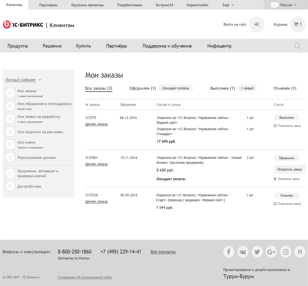
Initially, I reviewed the structures of both the client’s and partner’s websites in the 1C-Bitrix ecosystem to gain a deeper understanding of the website content.
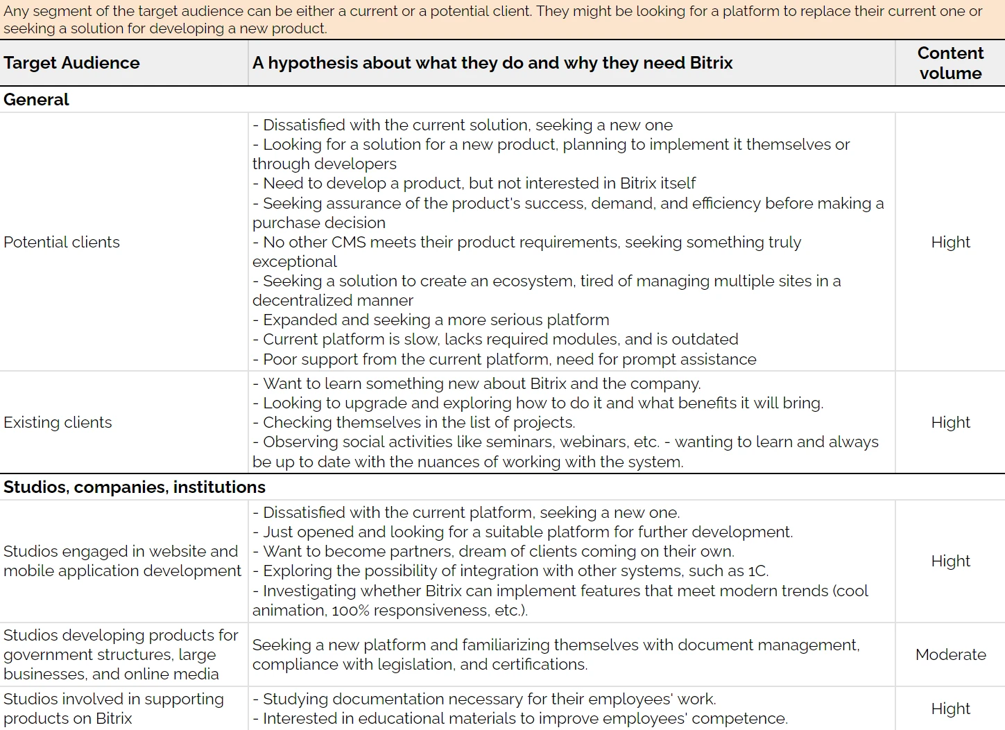
Target audience
I identified the target audience of the existing product to better understand the needs, desires, and behaviors of current and potential users. This also helped focus on the key features that are most important to users.
Here is a partial list of target audience segments. The full list is available in Google Sheets.
Analytics data
We analyzed Google Analytics data and identified a list of problems users face. Here are some findings:
Key pages of the website contained a lot of information unrelated to users.
Users only visited a few items in the main menu, leading to misunderstandings about the product concept.
Users often "wandered" around the site, visiting random pages and not achieving their goals.
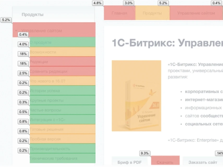
We then developed a map based on analytics data, highlighting the most and least visited sections of the site.
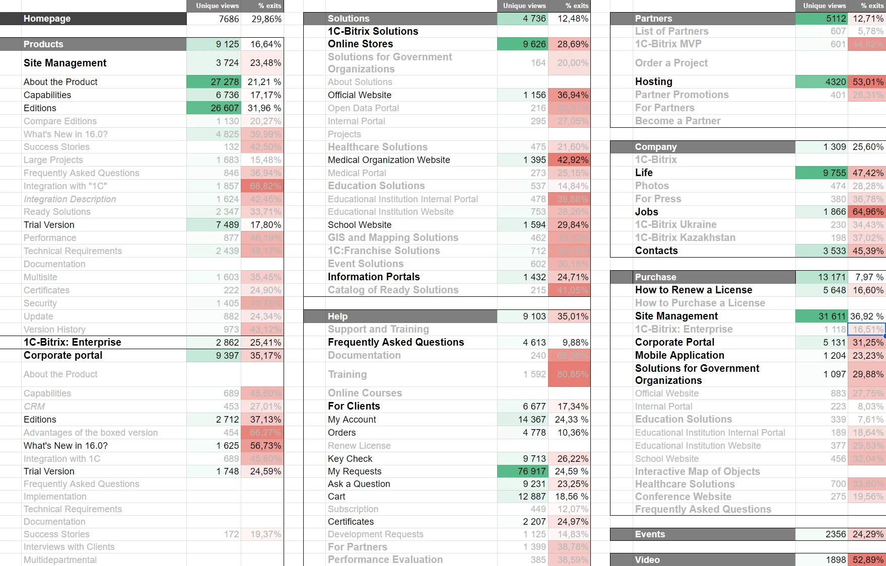
View the full table

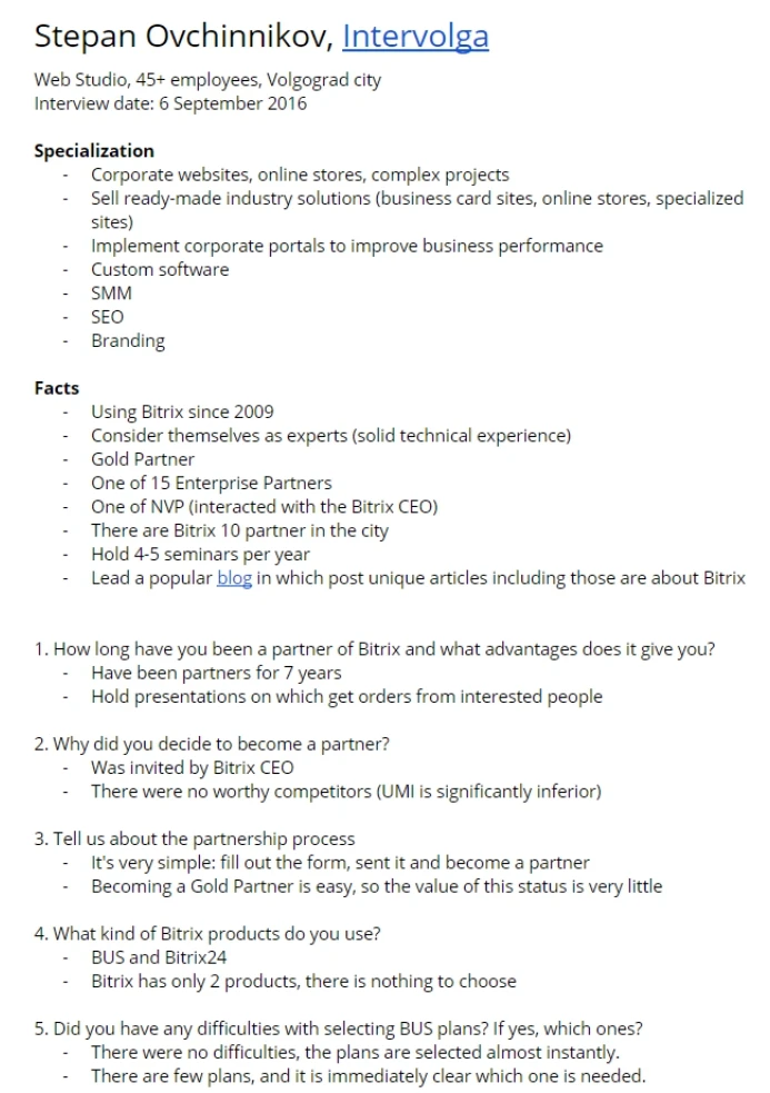
In-depth interviews
We conducted in-depth interviews with various users of the product to gather the necessary information for further work. We prepared questions in advance for each type of participant and obtained a wealth of valuable data during the interviews.
Among the respondents were:
- Owners of three different companies that hold the status of Gold partner of "1C-Bitrix" and use this CMS as their primary tool in their development process.
- An online store owner.
- A representative of a government organization.
- An offline business owner.
- A subscriber.
Conclusions
Based on the collected data, we formulated conclusions about the categories of website users. Some of these conclusions included:
1.
Users trying to find "their" product move chaotically among various products and solutions on the client’s site, failing to find the necessary information.
2.
Users are overwhelmed by numerous options, such as products, pricing plans, features, ready-made solutions, and extensions, while they typically have a specific need to create a certain website.
3.
Product pages are largely filled with information that does not lead to a purchase. For most users, this content is considered "junk" and is only useful to a small part of the audience.
4.
Unclear functionality of client and partner accounts leads to constant switching between sites, which frustrates users.
5.
The navigation model is ineffective, as users do not notice and/or do not use most navigation elements.
6.
Some users feel that the site is aimed at developers due to the abundance of technical information, which causes them to leave the site.
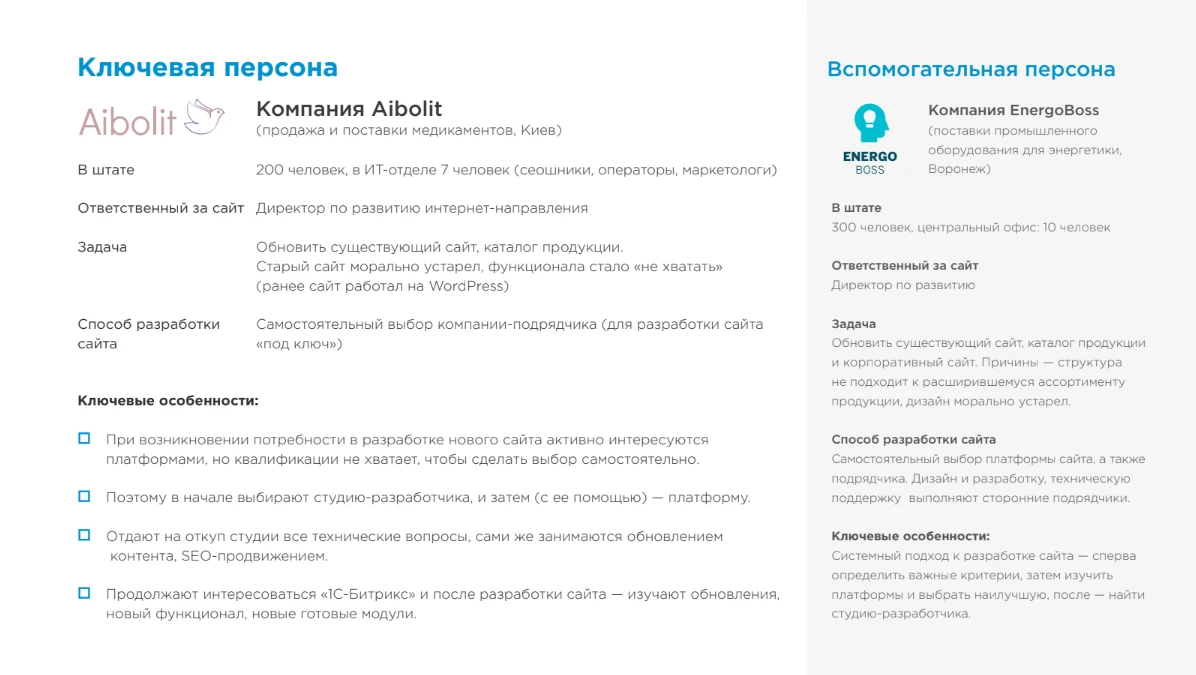
Personas
Based on research data, we created four personas.
Two client personas:
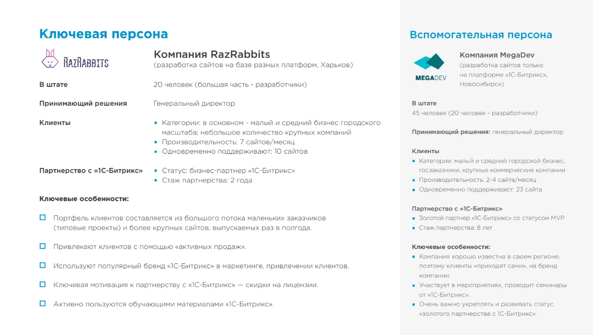
And two partner personas:
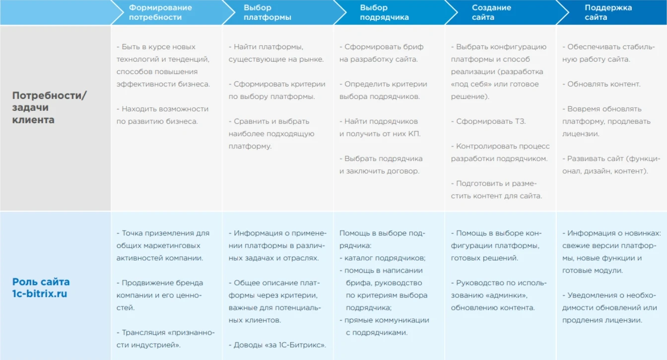
Customer Journey Map
We then developed a CJM to fully describe the customer flow, providing a deep understanding of their interactions and experiences at each stage.
Scenarios and cases
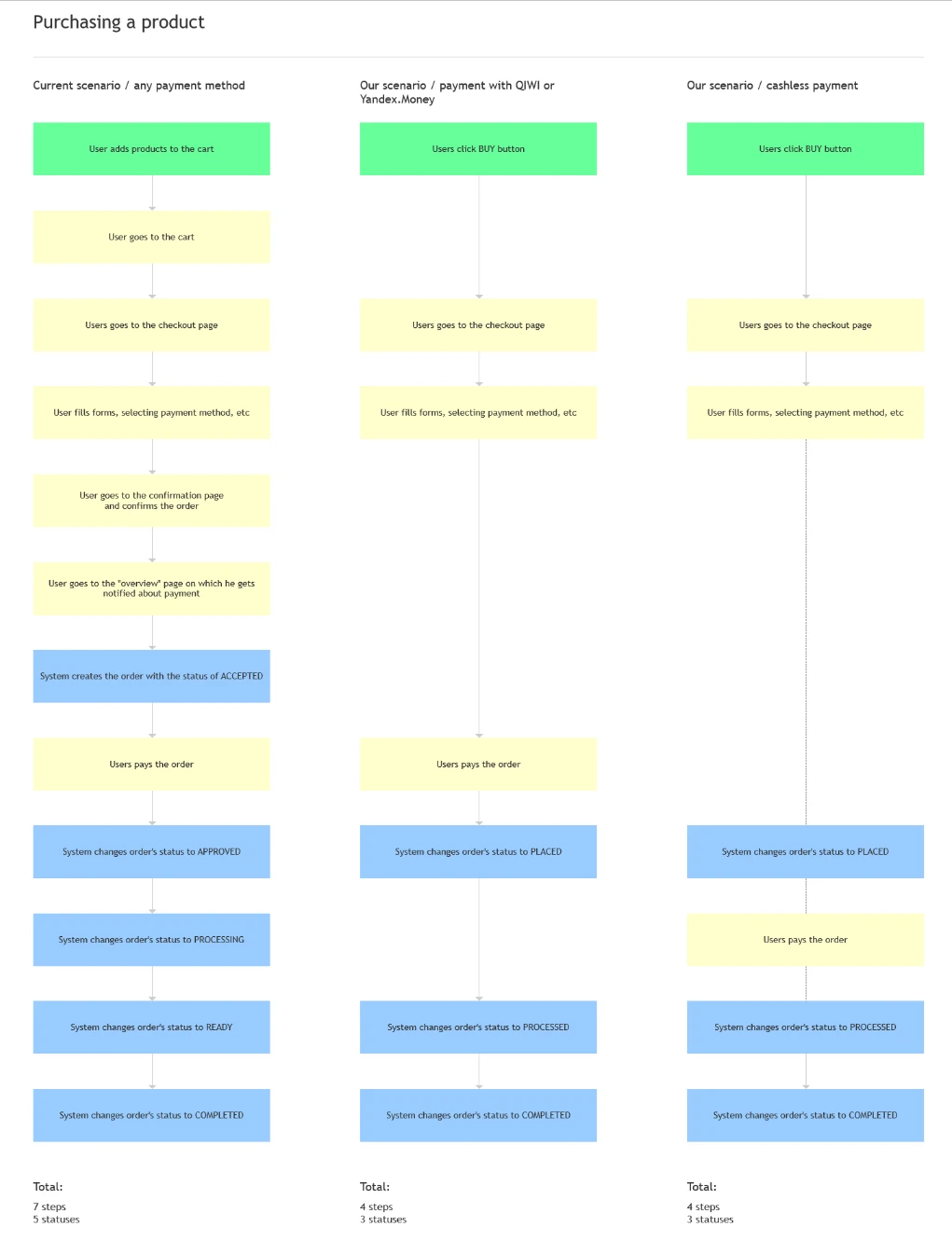
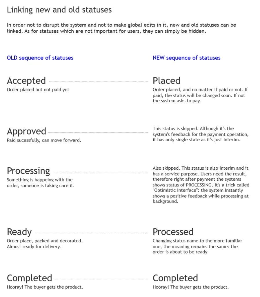
We created a series of scenarios and use cases. Here are the most significant ones:
- Product planning and solution selection
- Choosing a partner and creating a development request
- Purchasing the product
- Submitting a partnership application
- Responding to customer inquiries
- Renewing a license

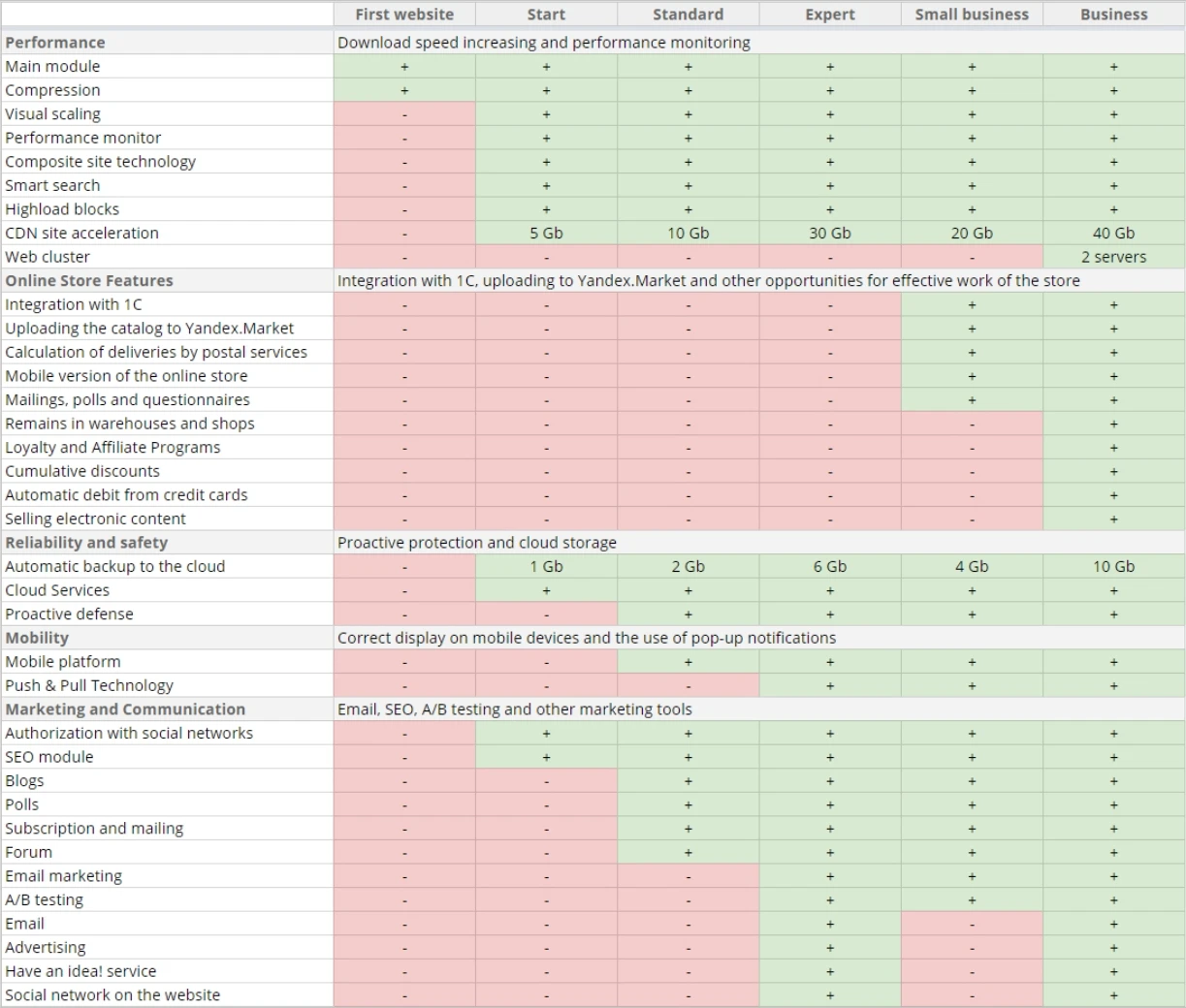
Plan comparison
This was a critical stage, as it is a key step in the sales funnel. This section required significant work to create it from scratch due to its initially disorganized and incoherent structure. We put considerable effort into reorganizing and optimizing the plan comparison process to enhance clarity and efficiency.
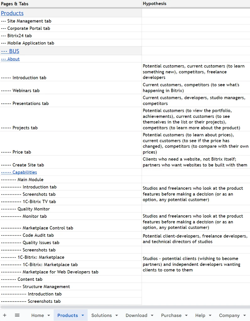
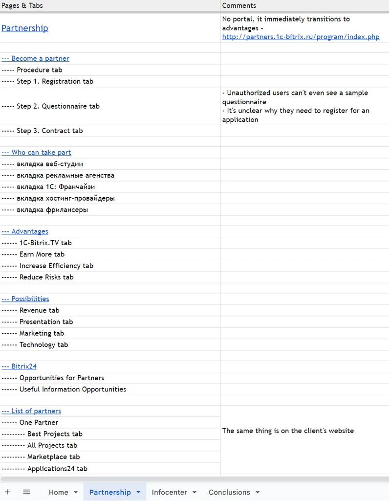
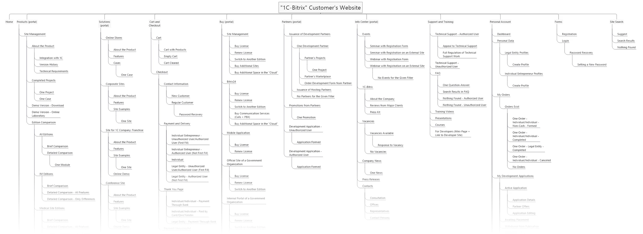
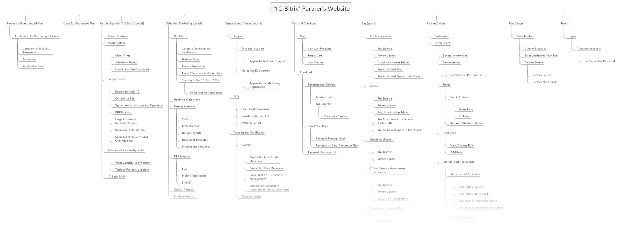
New structure
I developed a structure for the client and partner websites based on all the data collected during the work process, aiming to organize content and ensure logical navigation. The structure turned out to be quite extensive, so here I present only a part of it. The full structure is available via the links below.
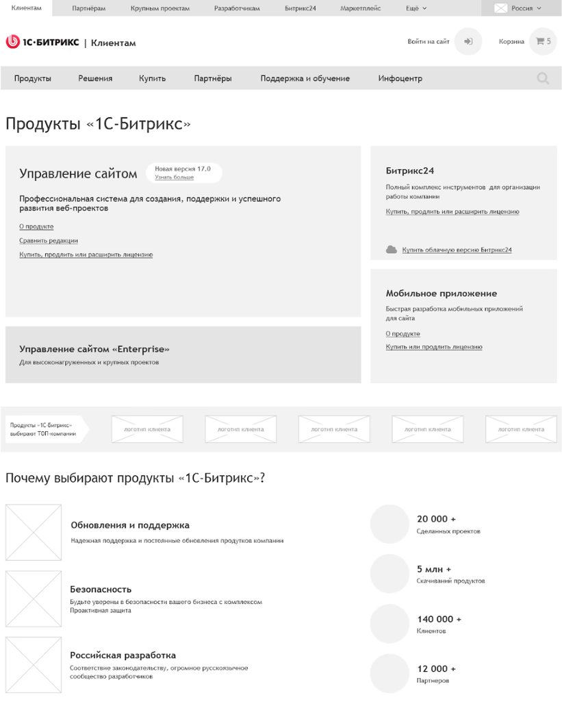
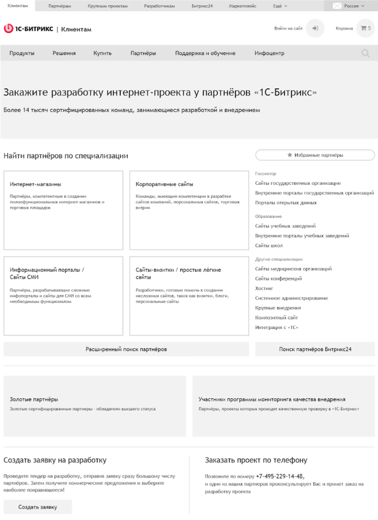
Prototypes
I developed prototypes for over 400 pages, most of which were dynamic and had over 1000 states. All prototypes contained real content, without lorem ipsum. These prototypes were then handed over to the interface designer, who spent over 400 hours creating layouts.

Current status
The product successfully received a new design, after which it became even more successful: the product is evolving, and the number of partners and projects in development is rapidly growing. As of 2021, "1C-Bitrix: Site Management" was the most popular commercial CMS by real installations on websites according to the iTrack rating.
Let’s talk
telegram
cv
To Homepage
1C-Bitrix
Redesign of the leading CMS website in Russia and the CIS.

Company
Turum-burum
Timeline
2016 — 2017
Team
- Me as a UX designer/researcher
- Head of the UX/UI department as art director and PM
- Web analyst
- Business analyst
- Three UI designers
- Specially invited mentor for the project
- (former information architect at Yandex)
275,000+
web projects have been developed on 1C-Bitrix
17,000+
companies in the partner network
Results and metrics
- Key scenarios for clients were significantly simplified, leading to a 35% increase in product purchase conversion.
- The new structure resulted in a 28% reduction in bounce rates.
- The workflow with the partner site was significantly optimized. License renewal now takes three times less time.
Problems
- High information load on users — too much content per unit area.
- Complex scenarios for selecting and purchasing products.
- Uncontrolled and unsystematic growth of content on the website. New information was sometimes added to sections where users were unlikely to find it.
- A significant amount of "outdated" content that was necessary, but no one knew where to place it in these situations.

What I did
- Identified the existing target audience of the product.
- Conducted a review of the current website structures in the product ecosystem and determined further steps.
- Studied analytics data and identified weak points.
- Participated in interviews with business partners to gather feedback.
- Formulated hypotheses about user categories on the website based on the data obtained.
- Created personas based on research data.
- Developed CJM, scenarios, use cases, and a new website structure.
- Redesigned product plan comparisons.
- Created prototypes for over 400 pages.
Solution
Initially, I reviewed the structures of both the client’s and partner’s websites in the 1C-Bitrix ecosystem to gain a deeper understanding of the website content.
Target audience
I identified the target audience of the existing product to better understand the needs, desires, and behaviors of current and potential users. This also helped focus on the key features that are most important to users.
Here is a partial list of target audience segments. The full list is available in Google Sheets.
Analytics data
We analyzed Google Analytics data and identified a list of problems users face. Here are some findings:
Key pages of the website contained a lot of information unrelated to users.
Users only visited a few items in the main menu, leading to misunderstandings about the product concept.
Users often "wandered" around the site, visiting random pages and not achieving their goals.
We then developed a map based on analytics data, highlighting the most and least visited sections of the site.
View the full table

In-depth interviews
We conducted in-depth interviews with various users of the product to gather the necessary information for further work. We prepared questions in advance for each type of participant and obtained a wealth of valuable data during the interviews.
Among the respondents were:
- Owners of three different companies that hold the status of Gold partner of "1C-Bitrix" and use this CMS as their primary tool in their development process.
- An online store owner.
- A representative of a government organization.
- An offline business owner.
- A subscriber.
Conclusions
Based on the collected data, we formulated conclusions about the categories of website users. Some of these conclusions included:
1.
Users trying to find "their" product move chaotically among various products and solutions on the client’s site, failing to find the necessary information.
2.
Users are overwhelmed by numerous options, such as products, pricing plans, features, ready-made solutions, and extensions, while they typically have a specific need to create a certain website.
3.
Product pages are largely filled with information that does not lead to a purchase. For most users, this content is considered "junk" and is only useful to a small part of the audience.
4.
Unclear functionality of client and partner accounts leads to constant switching between sites, which frustrates users.
5.
The navigation model is ineffective, as users do not notice and/or do not use most navigation elements.
6.
Some users feel that the site is aimed at developers due to the abundance of technical information, which causes them to leave the site.
Personas
Based on research data, we created four personas.
Two client personas:
And two partner personas:
Customer Journey Map
We then developed a CJM to fully describe the customer flow, providing a deep understanding of their interactions and experiences at each stage.
Scenarios and cases
We created a series of scenarios and use cases. Here are the most significant ones:
- Product planning and solution selection
- Choosing a partner and creating a development request
- Purchasing the product
- Submitting a partnership application
- Responding to customer inquiries
- Renewing a license
Plan comparison
This was a critical stage, as it is a key step in the sales funnel. This section required significant work to create it from scratch due to its initially disorganized and incoherent structure. We put considerable effort into reorganizing and optimizing the plan comparison process to enhance clarity and efficiency.
New structure
I developed a structure for the client and partner websites based on all the data collected during the work process, aiming to organize content and ensure logical navigation. The structure turned out to be quite extensive, so here I present only a part of it. The full structure is available via the links below.
Prototypes
I developed prototypes for over 400 pages, most of which were dynamic and had over 1000 states. All prototypes contained real content, without lorem ipsum. These prototypes were then handed over to the interface designer, who spent over 400 hours creating layouts.
Current status
The product successfully received a new design, after which it became even more successful: the product is evolving, and the number of partners and projects in development is rapidly growing. As of 2021, "1C-Bitrix: Site Management" was the most popular commercial CMS by real installations on websites according to the iTrack rating.
Let’s talk
telegram
cv
To Homepage
1C-Bitrix
Redesign of the leading CMS website in Russia and the CIS.
Company
Turum-burum
Timeline
2016 — 2017
Team
- Me as a UX designer/researcher
- Head of the UX/UI department as art director and PM
- Web analyst
- Business analyst
- Three UI designers
- Specially invited mentor for the project
- (former information architect at Yandex)
275,000+
web projects have been developed on 1C-Bitrix
17,000+
companies in the partner network
Results and metrics
- Key scenarios for clients were significantly simplified, leading to a 35% increase in product purchase conversion.
- The new structure resulted in a 28% reduction in bounce rates.
- The workflow with the partner site was significantly optimized. License renewal now takes three times less time.
Problems
- High information load on users — too much content per unit area.
- Complex scenarios for selecting and purchasing products.
- Uncontrolled and unsystematic growth of content on the website. New information was sometimes added to sections where users were unlikely to find it.
- A significant amount of "outdated" content that was necessary, but no one knew where to place it in these situations.

What I did
- Identified the existing target audience of the product.
- Conducted a review of the current website structures in the product ecosystem and determined further steps.
- Studied analytics data and identified weak points.
- Participated in interviews with business partners to gather feedback.
- Formulated hypotheses about user categories on the website based on the data obtained.
- Created personas based on research data.
- Developed CJM, scenarios, use cases, and a new website structure.
- Redesigned product plan comparisons.
- Created prototypes for over 400 pages.
Solution
Initially, I reviewed the structures of both the client’s and partner’s websites in the 1C-Bitrix ecosystem to gain a deeper understanding of the website content.
Target audience
I identified the target audience of the existing product to better understand the needs, desires, and behaviors of current and potential users. This also helped focus on the key features that are most important to users.
Here is a partial list of target audience segments. The full list is available in Google Sheets.
Analytics data
We analyzed Google Analytics data and identified a list of problems users face. Here are some findings:
Key pages of the website contained a lot of information unrelated to users.
Users only visited a few items in the main menu, leading to misunderstandings about the product concept.
Users often "wandered" around the site, visiting random pages and not achieving their goals.
We then developed a map based on analytics data, highlighting the most and least visited sections of the site.
View the full table

In-depth interviews
We conducted in-depth interviews with various users of the product to gather the necessary information for further work. We prepared questions in advance for each type of participant and obtained a wealth of valuable data during the interviews.
Among the respondents were:
- Owners of three different companies that hold the status of Gold partner of "1C-Bitrix" and use this CMS as their primary tool in their development process.
- An online store owner.
- A representative of a government organization.
- An offline business owner.
- A subscriber.
Conclusions
Based on the collected data, we formulated conclusions about the categories of website users. Some of these conclusions included:
1.
Users trying to find "their" product move chaotically among various products and solutions on the client’s site, failing to find the necessary information.
2.
Users are overwhelmed by numerous options, such as products, pricing plans, features, ready-made solutions, and extensions, while they typically have a specific need to create a certain website.
3.
Product pages are largely filled with information that does not lead to a purchase. For most users, this content is considered "junk" and is only useful to a small part of the audience.
4.
Unclear functionality of client and partner accounts leads to constant switching between sites, which frustrates users.
5.
The navigation model is ineffective, as users do not notice and/or do not use most navigation elements.
6.
Some users feel that the site is aimed at developers due to the abundance of technical information, which causes them to leave the site.
Personas
Based on research data, we created four personas.
Two client personas:
And two partner personas:
Customer Journey Map
We then developed a CJM to fully describe the customer flow, providing a deep understanding of their interactions and experiences at each stage.
Scenarios and cases
We created a series of scenarios and use cases. Here are the most significant ones:
- Product planning and solution selection
- Choosing a partner and creating a development request
- Purchasing the product
- Submitting a partnership application
- Responding to customer inquiries
- Renewing a license
Plan comparison
This was a critical stage, as it is a key step in the sales funnel. This section required significant work to create it from scratch due to its initially disorganized and incoherent structure. We put considerable effort into reorganizing and optimizing the plan comparison process to enhance clarity and efficiency.
New structure
I developed a structure for the client and partner websites based on all the data collected during the work process, aiming to organize content and ensure logical navigation. The structure turned out to be quite extensive, so here I present only a part of it. The full structure is available via the links below.
Prototypes
I developed prototypes for over 400 pages, most of which were dynamic and had over 1000 states. All prototypes contained real content, without lorem ipsum. These prototypes were then handed over to the interface designer, who spent over 400 hours creating layouts.
Current status
The product successfully received a new design, after which it became even more successful: the product is evolving, and the number of partners and projects in development is rapidly growing. As of 2021, "1C-Bitrix: Site Management" was the most popular commercial CMS by real installations on websites according to the iTrack rating.
Let’s talk
telegram
cv