
To Homepage

Triafly
Redesign of a low-code platform for automating analytical processes.
Company
Triafly
Role
Product designer
Timeline
2024 — 2025
Triafly ↗ is a Russian low-code platform for automating analytical processes. It brings together tools for data preparation, data mart creation, and building interactive dashboards. The product enables companies to launch analytics quickly without complex development.
About this case study
The case is primarily technical and executed with a product-oriented approach: interfaces, design system, tokens, themes, and component architecture.Due to B2B specifics, limited access to users, and significant technical debt, alsmost no research was conducted — the design was based on technical specifications.
Problems
The Triafly design lagged behind competing solutions (Visiology, Foresight, Microsoft Fabric): the product relied heavily on customization during implementation and offered too few ready-made, out-of-the-box user scenarios.Additionally, the team had no designer for many years, which exacerbated the accumulation of UX issues:

There was no role-based separation — all users ended up in the same workspace regardless of their tasks
Several functional modules were inconveniently combined into a single screen, making navigation and the overall logic harder to understand
Onboarding took a lot of time — in some cases up to six months
Poorly thought-out UX made the product hostile to users: clients couldn’t work independently and constantly contacted support
In addition, weak interface architecture negatively affected performance — the system felt slow and overloaded

Business goals and success criteria
Before starting work, we collaborated with the team to define the key product goals and clear success criteria. This allowed us to focus on user value, scalability, and reducing the burden on the team.
Below is a brief correspondence between business goals and expected outcomes:
Business goal
Reduce the support load — users solve basic tasks independently
Success criterion
Support only handles complex cases; minor tasks are resolved without their involvement
Business goal
Ensure quick onboarding and training for new business users
Success criterion
Onboarding takes a few days, after which users operate autonomously
Business goal
Reduce the development time for application solutions
Success criterion
The new process is set up in 1 day instead of 2 weeks
Business goal
Free developers from routine configuration tasks
Success criterion
>80% of routine tasks are solved without developer involvement
Business goal
Scale the product without increasing support
Success criterion
The number of user teams grows without expanding the support team
Business goal
Reduce the number of errors due to manual configuration
Success criterion
A 60% reduction in user errors and 'how to configure' requests
Business goal
Ensure transparency and control without code access
Success criterion
Configuration, auditing, and review are accessible to product managers and analysts without engineers

Approach
Due to massive technical debt, a decision was made to completely refresh the product’s visual layer based on a new design system.In practice, this meant a full product redesign: adding missing functionality and unifying the user experience.
What I’ve done

Defined JTBD and key role-based scenarios (desk research)
Developed a full-fledged design system with tokens and dark theme support
Designed interfaces for the ETL module and the analytical data warehouse system
Translated product owner and system analyst requirements into detailed UX/UI layouts
Standardized patterns and improved the product’s visual consistency
Organized design handoff to development and ensured correct implementation
Worked through UX logic with consideration for the platform’s technical constraints
Created interactive prototypes and presented them to decision-makers
Jobs To Be Done
Since the project is B2B and access to end users was limited, instead of classic interviews, I documented key Jobs-to-be-Done by roles. This helped to structure the interface, separate roles, and identify critical points.
Role
JTBD
Success criterion
What was supported
Data engineer / implementer
Connect the data source and validate the connection
Connection test + clear errors
Master + statuses + errors
Data engineer
Build a pipeline/dashboard from steps and safely change transformations
Readable schema + quick debugging
Pipeline builder + debugging
Analyst
Quickly find the required dataset and understand if it can be trusted
Search in 1–2 minutes
Data catalog + metadata
Business user
Build a dashboard without code and with a "clear start"
MVP in 30–60 minutes
Templates + guided setup
Admin / support
Control access and system stability
Roles + transparent statuses
RBAC + monitoring
Design system
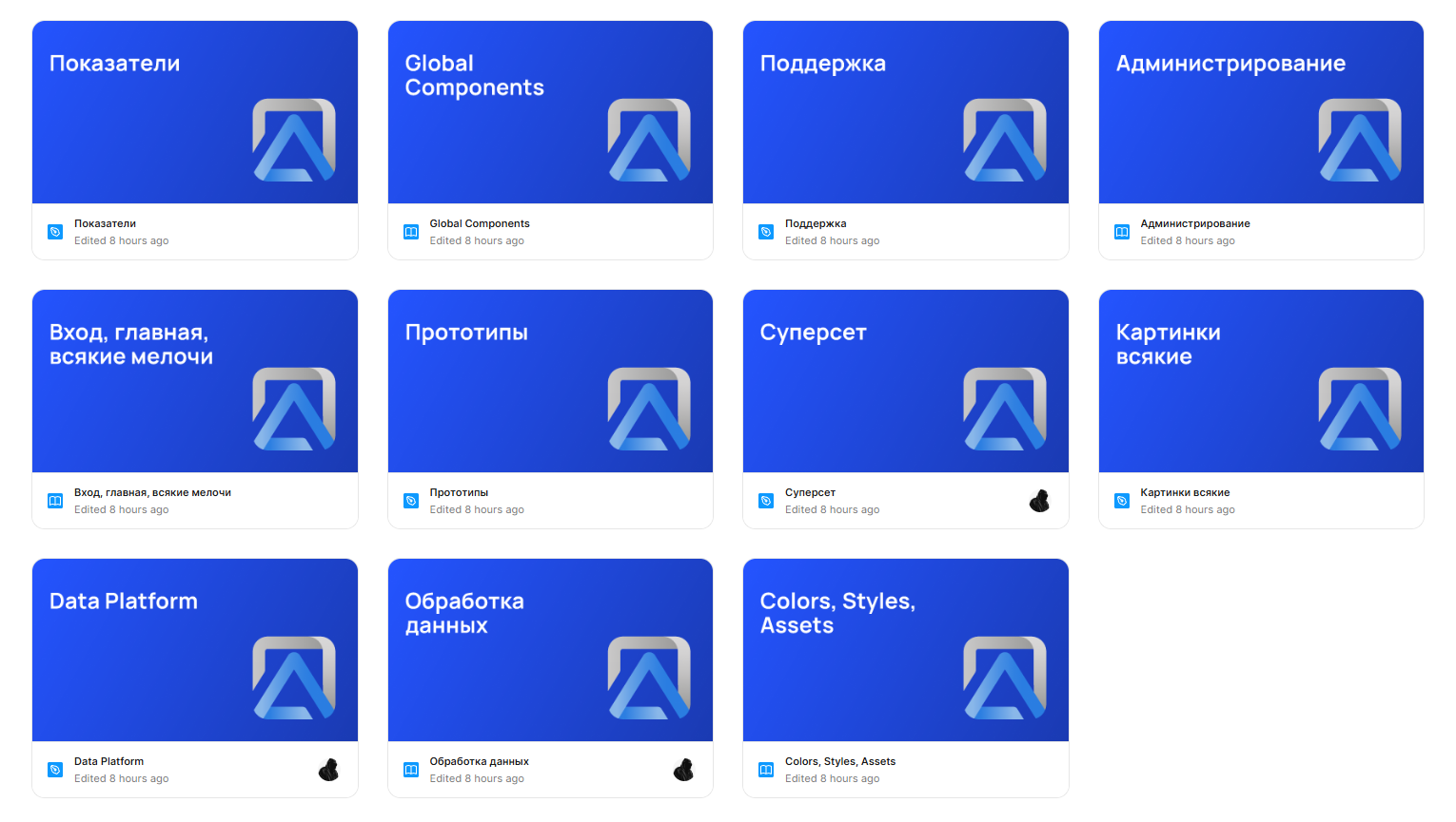
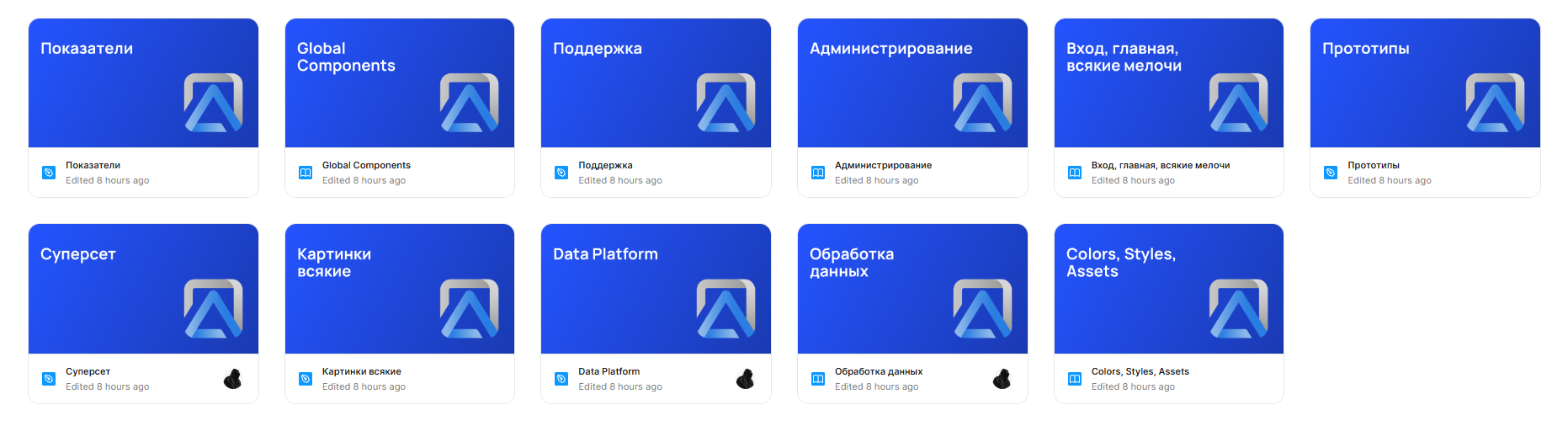
I built a flexible design system from scratch, including global and local components, color and typography tokens, as well as a set of styles and assets (icons, illustrations, logos). As shown in the image below, the project files are neatly structured and interconnected.
More about design system

UI
Below are several screens showcasing the product’s visual design. They can also be viewed in both light and dark themes.
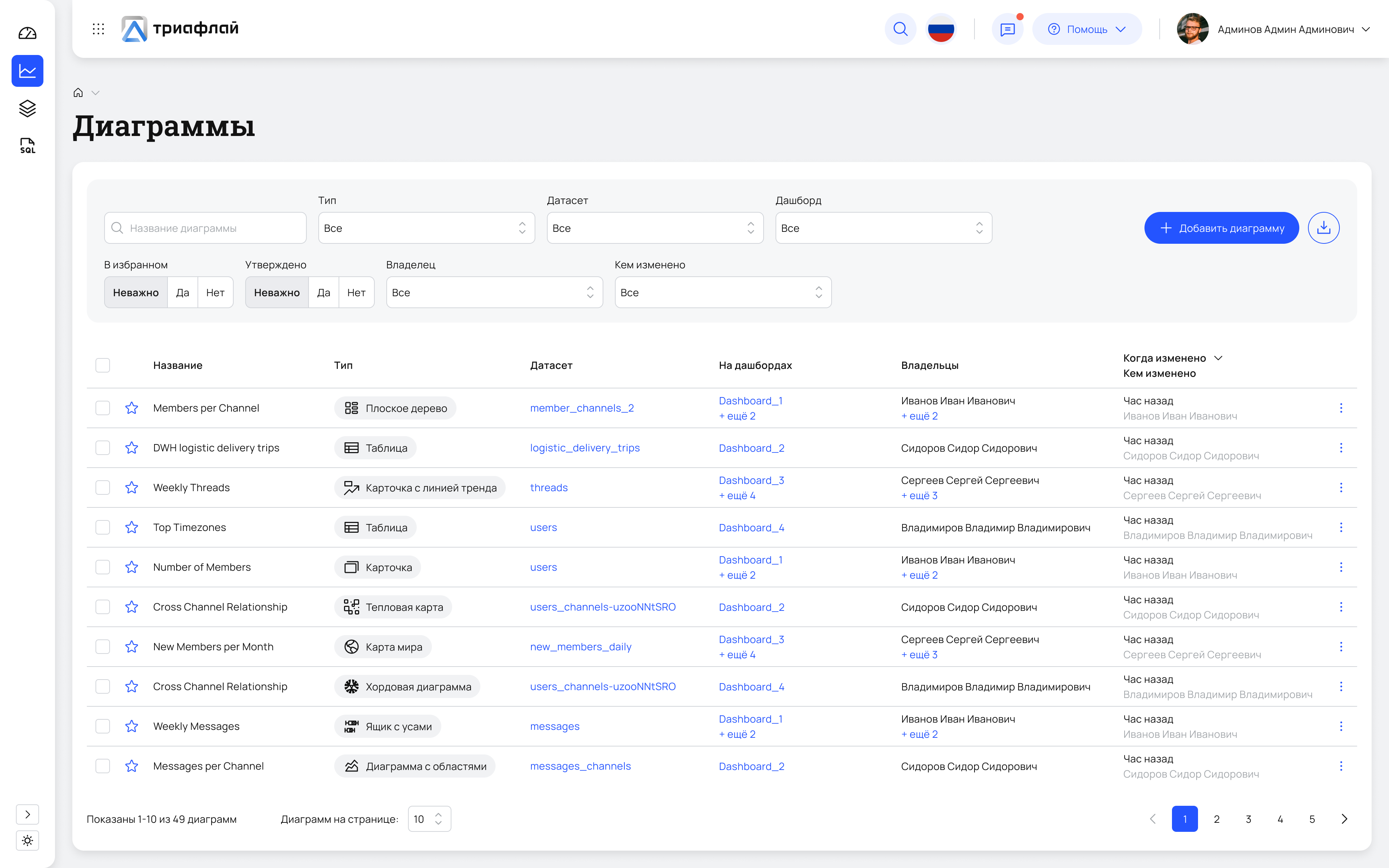
Diagram list in Superset
This is the catalog of all visualizations: here you can browse, search, filter charts, and navigate to their editing.

Light
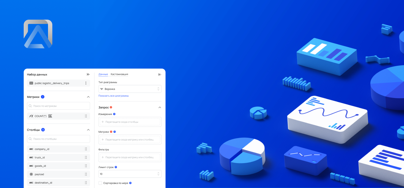
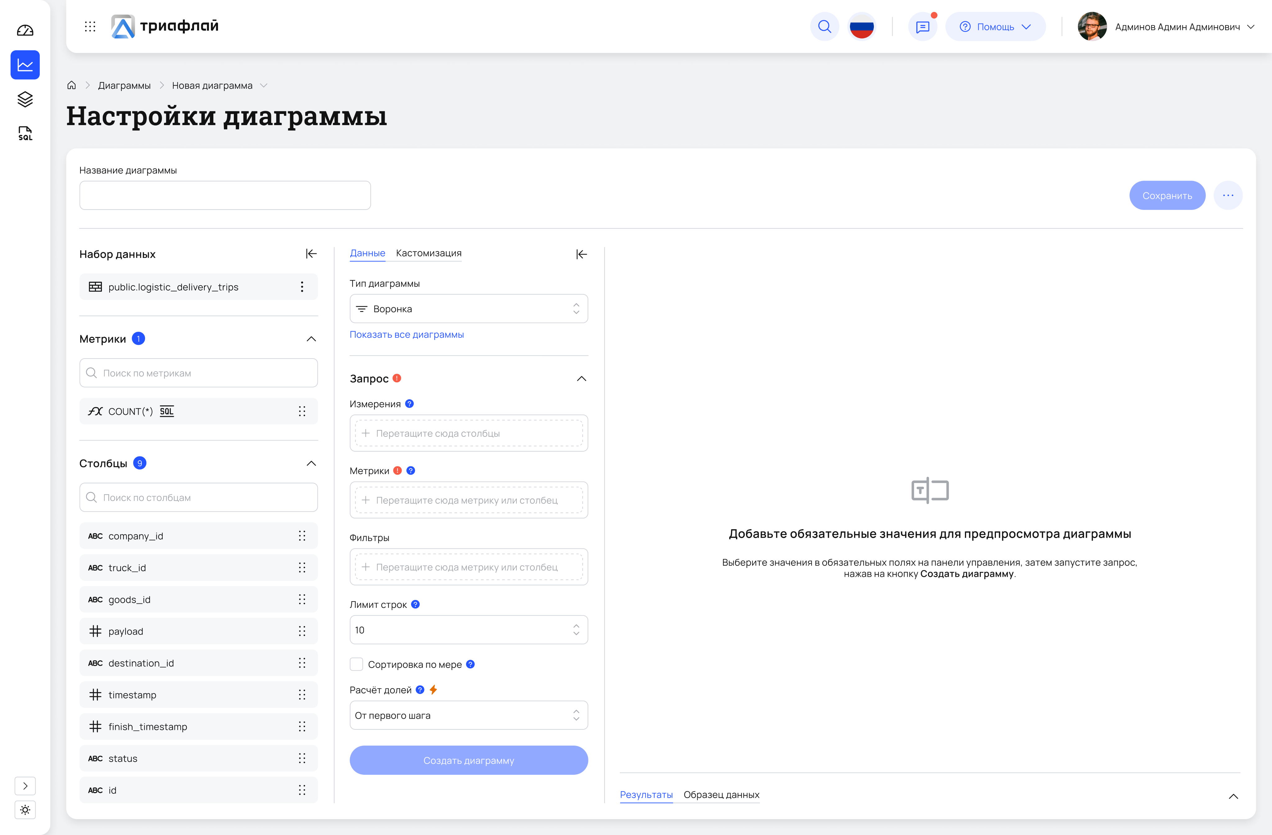
Creating a diagram
A workspace for configuring visualizations: selecting the data source, metrics, dimensions, filters, and chart type.
Light
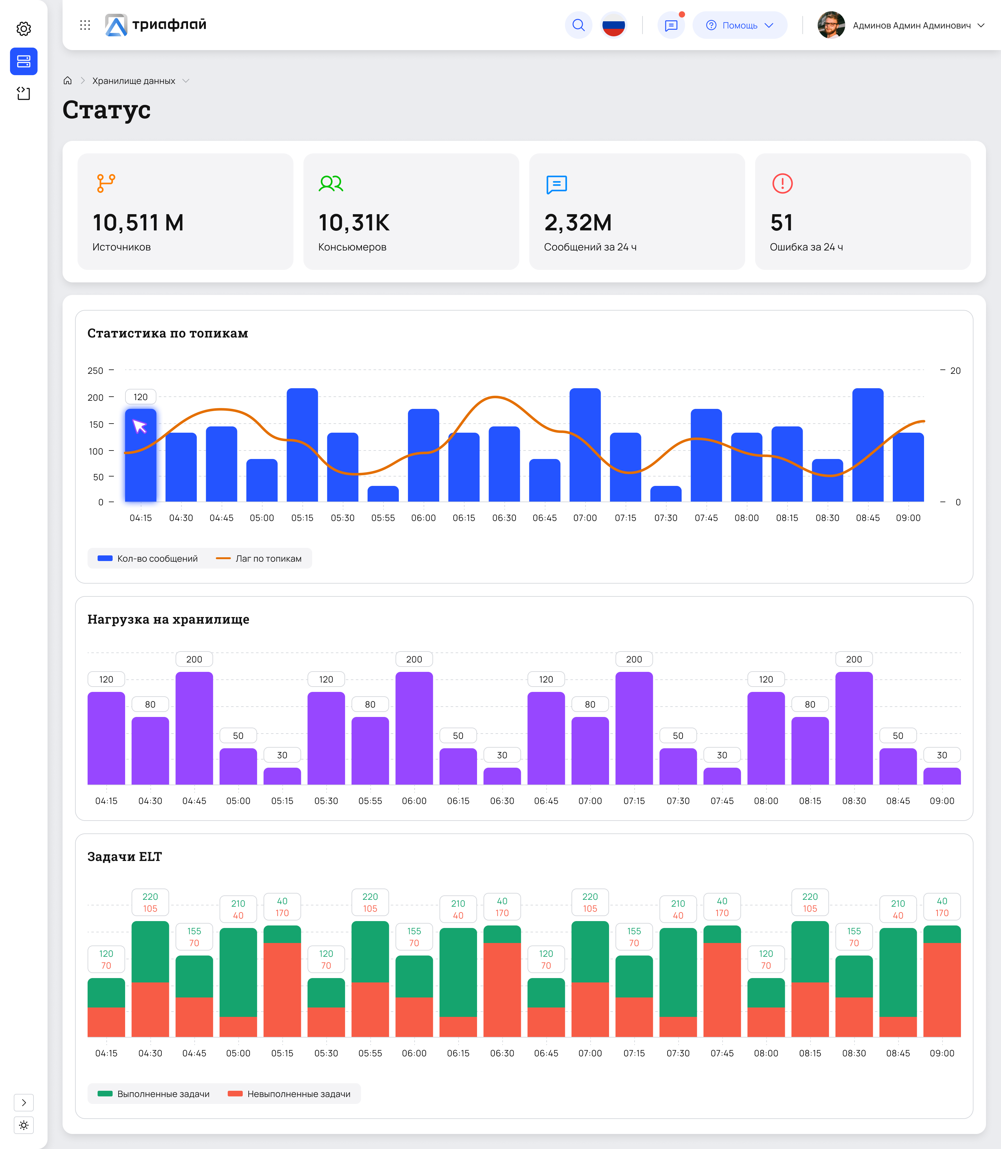
Status
A screen for quick system health checks: key metrics, topic load, lag, and ELT task execution. Helps teams quickly spot anomalies and understand whether issues come from data, processing, or infrastructure.
Light
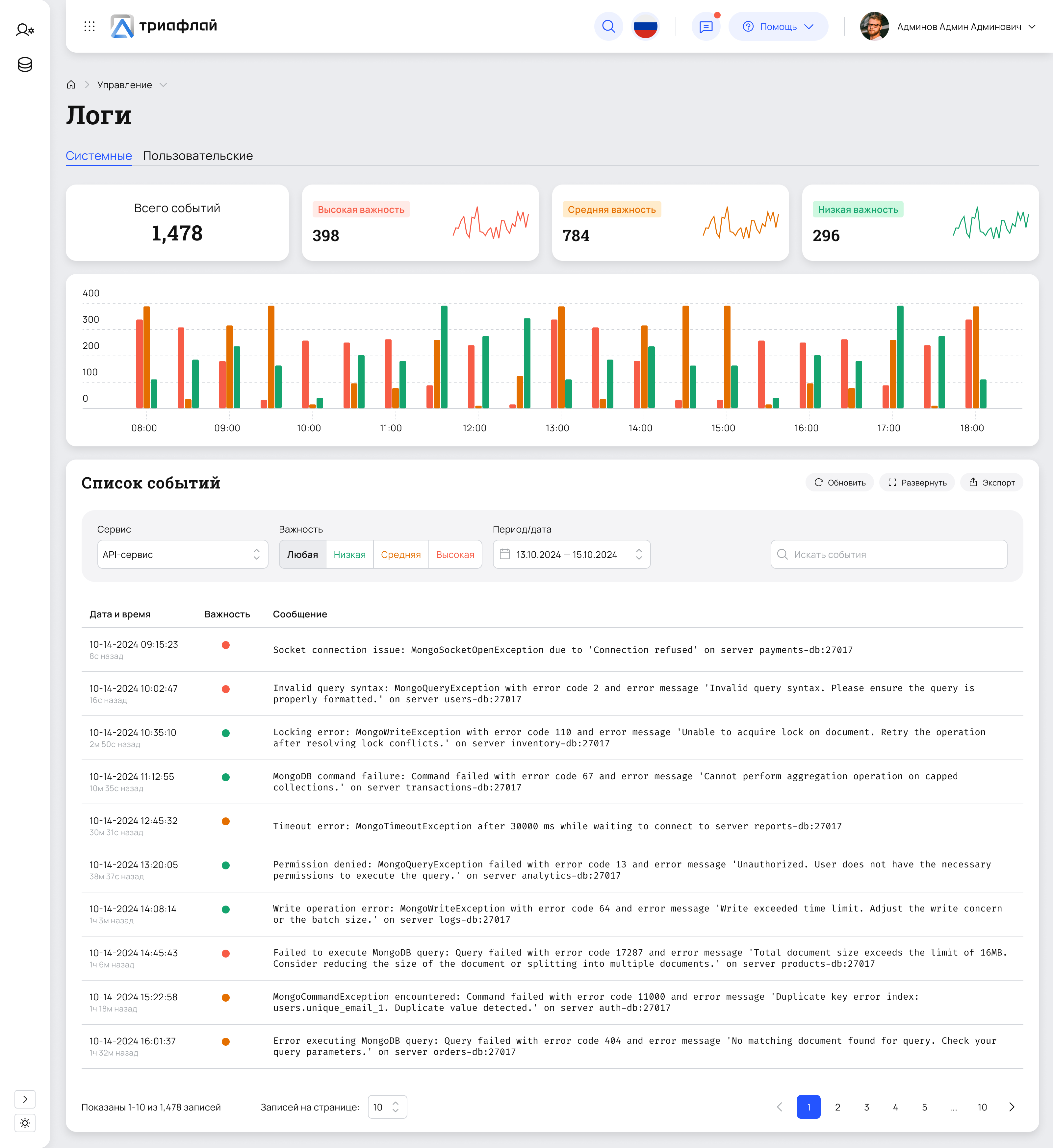
Logs
The logs screen displays system events: errors, warnings, and service statuses. At the top, key metrics and an activity chart are shown; below is an event table with filters by service, severity, and date. The interface helps quickly identify issues in system operation.
Light
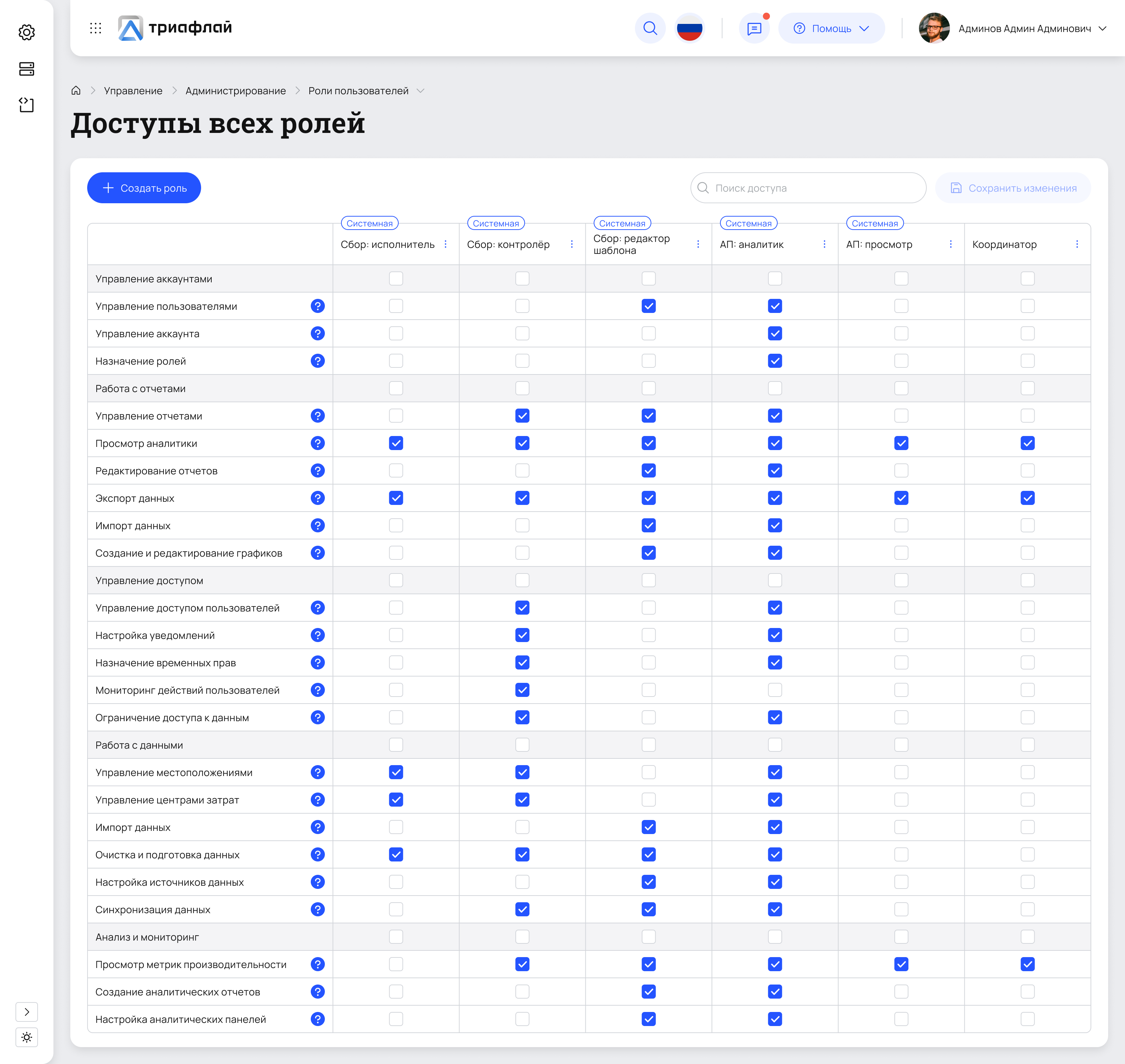
Roles & permissions management
A matrix-based screen for configuring access rights across all system roles. Enables administrators to quickly assign, review, and audit permissions, reducing configuration errors and improving access transparency.
Light
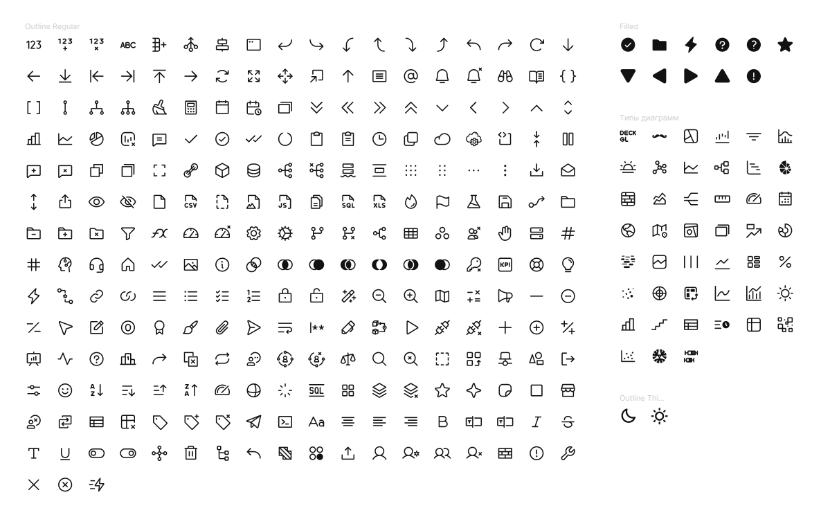
Icons
Most of the icons were taken from open-source sets — Phosphor, Tabler, Dazzle, and MyIcons. Some icons, such as certain chart types, were designed by me from scratch.
All icons are stored in a dedicated Colors, Styles, Assets file, which makes them easy to maintain, reuse across different project files, and update centrally when changes are needed.
Logic
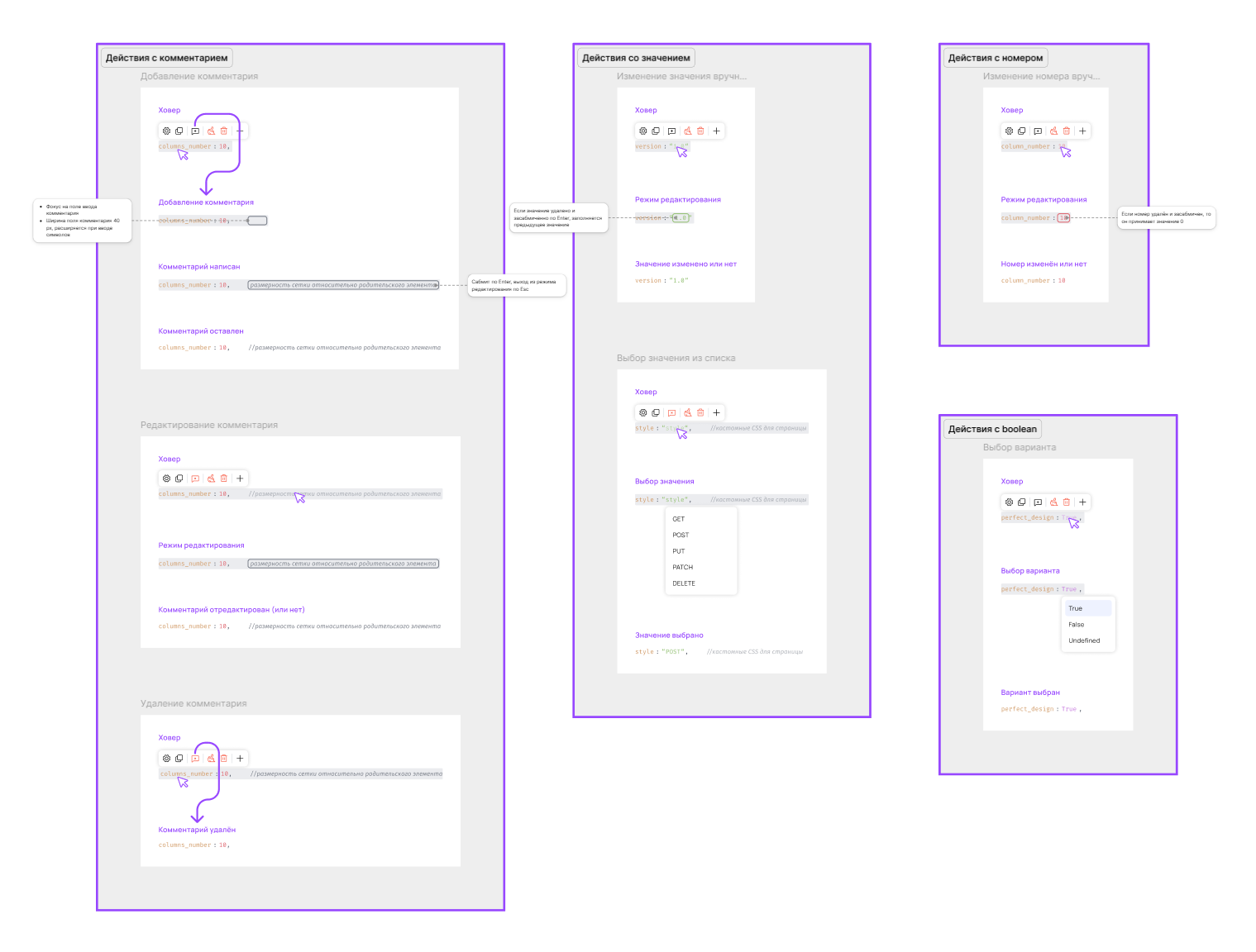
I visualized scenario logic as sequential flow diagrams. This format helps quickly understand the order of actions and element interactions without needing to run a prototype. Annotations were also used extensively. Below are a few examples.
3
Current status
The project was halted due to the termination of external funding, after which a significant part of the team was laid off. Product development in its current form has been frozen.

Let’s talk
telegram
cv
To Homepage
Triafly
Redesign of a low-code platform for automating analytical processes.
Company
Triafly
Role
Product designer
Timeline
2024 — 2025
Triafly ↗ is a Russian low-code platform for automating analytical processes. It brings together tools for data preparation, data mart creation, and building interactive dashboards. The product enables companies to launch analytics quickly without complex development.
About this case study
The case is primarily technical and executed with a product-oriented approach: interfaces, design system, tokens, themes, and component architecture.Due to B2B specifics, limited access to users, and significant technical debt, almost no research was conducted — the design was based on technical specifications.
Problems
The Triafly design lagged behind competing solutions (Visiology, Foresight, Microsoft Fabric): the product relied heavily on customization during implementation and offered too few ready-made, out-of-the-box user scenarios.Additionally, the team had no designer for many years, which exacerbated the accumulation of UX issues:
There was no role-based separation — all users ended up in the same workspace regardless of their tasks
Several functional modules were inconveniently combined into a single screen, making navigation and the overall logic harder to understand
Onboarding took a lot of time — in some cases up to six months
Poorly thought-out UX made the product hostile to users: clients couldn’t work independently and constantly contacted support
In addition, weak interface architecture negatively affected performance — the system felt slow and overloaded

Business goals and success criteria
Before starting work, we collaborated with the team to define the key product goals and clear success criteria. This allowed us to focus on user value, scalability, and reducing the burden on the team.
Below is a brief correspondence between business goals and expected outcomes:
Business goal
Reduce the support load — users solve basic tasks independently
Success criterion
Support only handles complex cases; minor tasks are resolved without their involvement
Business goal
Ensure quick onboarding and training for new business users
Success criterion
Onboarding takes a few days, after which users operate autonomously
Business goal
Reduce the development time for application solutions
Success criterion
The new process is set up in 1 day instead of 2 weeks
Business goal
Free developers from routine configuration tasks
Success criterion
>80% of routine tasks are solved without developer involvement
Business goal
Scale the product without increasing support
Success criterion
The number of user teams grows without expanding the support team
Business goal
Reduce the number of errors due to manual configuration
Success criterion
A 60% reduction in user errors and 'how to configure' requests
Business goal
Ensure transparency and control without code access
Success criterion
Configuration, auditing, and review are accessible to product managers and analysts without engineers

Approach
Due to massive technical debt, a decision was made to completely refresh the product’s visual layer based on a new design system.In practice, this meant a full product redesign: adding missing functionality and unifying the user experience.
What I’ve done
Defined JTBD and key role-based scenarios (desk research)
Developed a full-fledged design system with tokens and dark theme support
Designed interfaces for the ETL module and the analytical data warehouse system
Translated product owner and system analyst requirements into detailed UX/UI layouts
Standardized patterns and improved the product’s visual consistency
Organized design handoff to development and ensured correct implementation
Worked through UX logic with consideration for the platform’s technical constraints
Created interactive prototypes and presented them to decision-makers
Jobs To Be Done
Since the project is B2B and access to end users was limited, instead of classic interviews, I documented key Jobs-to-be-Done by roles. This helped to structure the interface, separate roles, and identify critical points.
Role
JTBD
Success criterion
What was supported
Data engineer / implementer
Connect the data source and validate the connection
Connection test + clear errors
Master + statuses + errors
Data engineer
Build a pipeline/dashboard from steps and safely change transformations
Readable schema + quick debugging
Pipeline builder + debugging
Analyst
Quickly find the required dataset and understand if it can be trusted
Search in 1–2 minutes
Data catalog + metadata
Business user
Build a dashboard without code and with a "clear start"
MVP in 30–60 minutes
Templates + guided setup
Admin / support
Control access and system stability
Roles + transparent statuses
RBAC + monitoring
Design system
I built a flexible design system from scratch, including global and local components, color and typography tokens, as well as a set of styles and assets (icons, illustrations, logos). As shown in the image below, the project files are neatly structured and interconnected.
More about design system

UI
Below are several screens showcasing the product’s visual design. They can also be viewed in both light and dark themes.
Diagram list in Superset
This is the catalog of all visualizations: here you can browse, search, filter charts, and navigate to their editing.

Light
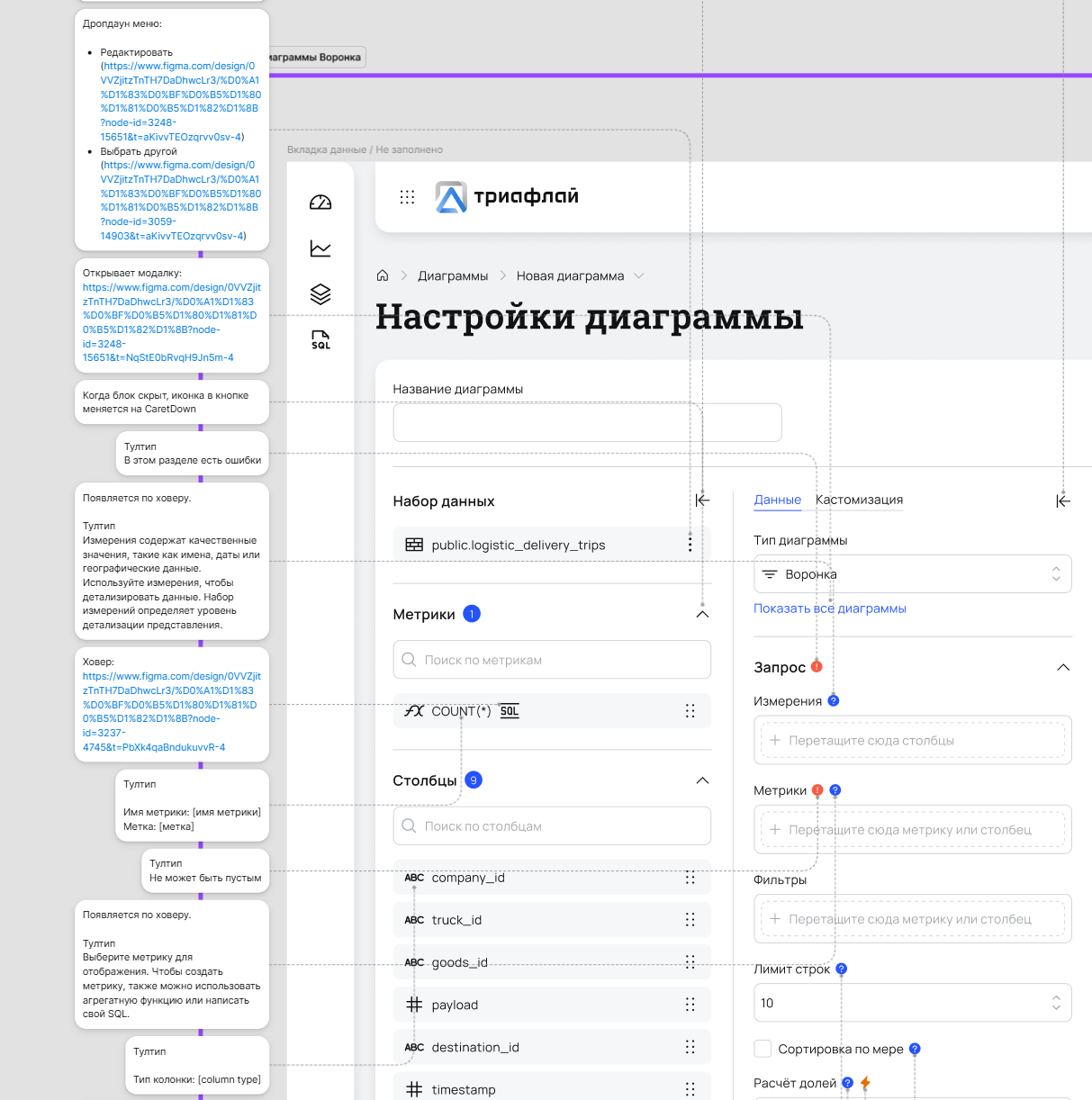
Creating a diagram
A workspace for configuring visualizations: selecting the data source, metrics, dimensions, filters, and chart type.
Light
Descriptors
A screen for quick system health checks: key metrics, topic load, lag, and ELT task execution. Helps teams quickly spot anomalies and understand whether issues come from data, processing, or infrastructure.
Light
Logs
The logs screen displays system events: errors, warnings, and service statuses. At the top, key metrics and an activity chart are shown; below is an event table with filters by service, severity, and date. The interface helps quickly identify issues in system operation.
Light
Roles & permissions management
A matrix-based screen for configuring access rights across all system roles. Enables administrators to quickly assign, review, and audit permissions, reducing configuration errors and improving access transparency.
Light
Icons
Most of the icons were taken from open-source sets — Phosphor, Tabler, Dazzle, and MyIcons. Some icons, such as certain chart types, were designed by me from scratch.
All icons are stored in a dedicated Colors, Styles, Assets file, which makes them easy to maintain, reuse across different project files, and update centrally when changes are needed.
Logic
I visualized scenario logic as sequential flow diagrams. This format helps quickly understand the order of actions and element interactions without needing to run a prototype. Annotations were also used extensively. Below are a few examples.
1
Current status
The project was halted due to the termination of external funding, after which a significant part of the team was laid off. Product development in its current form has been frozen.
Let’s talk
telegram
cv
To Homepage
Triafly
Redesign of a low-code platform for automating analytical processes.
Company
Triafly
Role
Product designer
Timeline
2024 — 2025
Triafly ↗ is a Russian low-code platform for automating analytical processes. It brings together tools for data preparation, data mart creation, and building interactive dashboards. The product enables companies to launch analytics quickly without complex development.
About this case study
The case is primarily technical and executed with a product-oriented approach: interfaces, design system, tokens, themes, and component architecture.Due to B2B specifics, limited access to users, and significant technical debt, almost no research was conducted — the design was based on technical specifications.
Problems
The Triafly design lagged behind competing solutions (Visiology, Foresight, Microsoft Fabric): the product relied heavily on customization during implementation and offered too few ready-made, out-of-the-box user scenarios.Additionally, the team had no designer for many years, which exacerbated the accumulation of UX issues:
There was no role-based separation — all users ended up in the same workspace regardless of their tasks
Several functional modules were inconveniently combined into a single screen, making navigation and the overall logic harder to understand
Onboarding took a lot of time — in some cases up to six months
Poorly thought-out UX made the product hostile to users: clients couldn’t work independently and constantly contacted support
In addition, weak interface architecture negatively affected performance — the system felt slow and overloaded

Business goalsand success criteria
Before starting work, we collaborated with the team to define the key product goals and clear success criteria. This allowed us to focus on user value, scalability, and reducing the burden on the team.
Below is a brief correspondence between business goals and expected outcomes:
Business goal
Reduce the support load — users solve basic tasks independently
Success criterion
Support only handles complex cases; minor tasks are resolved without their involvement
Business goal
Ensure quick onboarding and training for new business users
Success criterion
Onboarding takes a few days, after which users operate autonomously
Business goal
Reduce the development time for application solutions
Success criterion
The new process is set up in 1 day instead of 2 weeks
Business goal
Free developers from routine configuration tasks
Success criterion
>80% of routine tasks are solved without developer involvement
Business goal
Scale the product without increasing support
Success criterion
The number of user teams grows without expanding the support team
Business goal
Reduce the number of errors due to manual configuration
Success criterion
A 60% reduction in user errors and 'how to configure' requests
Business goal
Ensure transparency and control without code access
Success criterion
Configuration, auditing, and review are accessible to product managers and analysts without engineers
Approach
Due to massive technical debt, a decision was made to completely refresh the product’s visual layer based on a new design system.In practice, this meant a full product redesign: adding missing functionality and unifying the user experience.

What I’ve done
Defined JTBD and key role-basedscenarios (desk research)
Developed a full-fledged design systemwith tokens and dark theme support
Designed interfaces for the ETL moduleand the analytical data warehouse system
Translated product owner and system analystrequirements into detailed UX/UI layouts
Standardized patterns and improvedthe product’s visual consistency
Organized design handoff to developmentand ensured correct implementation
Worked through UX logic with considerationfor the platform’s technical constraints
Created interactive prototypesand presented them to decision-makers
Jobs To Be Done
Since the project is B2B and access to end users was limited, instead of classic interviews, I documented key Jobs-to-be-Done by roles. This helped to structure the interface, separate roles, and identify critical points.
Role
JTBD
Success criterion
What was supported
Data engineer / implementer
Connect the data source and validate the connection
Connection test + clear errors
Master + statuses + errors
Data engineer
Build a pipeline/dashboard from steps and safely change transformations
Readable schema + quick debugging
Pipeline builder + debugging
Analyst
Quickly find the required dataset and understand if it can be trusted
Search in 1–2 minutes
Data catalog + metadata
Business user
Build a dashboard without code and with a "clear start"
MVP in 30–60 minutes
Templates + guided setup
Admin / support
Control access and system stability
Roles + transparent statuses
RBAC + monitoring
Design system
I built a flexible design system from scratch, including global and local components, color and typography tokens, as well as a set of styles and assets (icons, illustrations, logos). As shown in the image below, the project files are neatly structured and interconnected.
More about design system
UI
Below are several screens showcasing the product’s visual design. They can also be viewed in both light and dark themes.
Diagram list in Superset
This is the catalog of all visualizations: here you can browse, search, filter charts, and navigate to their editing.
Light
Creating a diagram
A workspace for configuring visualizations: selecting the data source, metrics, dimensions, filters, and chart type.
Light
Status
A screen for quick system health checks: key metrics, topic load, lag, and ELT task execution. Helps teams quickly spot anomalies and understand whether issues come from data, processing, or infrastructure.
Light
Logs
The logs screen displays system events: errors, warnings, and service statuses. At the top, key metrics and an activity chart are shown; below is an event table with filters by service, severity, and date. The interface helps quickly identify issues in system operation.
Light
Roles & permissions management
A matrix-based screen for configuring access rights across all system roles. Enables administrators to quickly assign, review, and audit permissions, reducing configuration errors and improving access transparency.
Light
Icons
Most of the icons were taken from open-source sets — Phosphor, Tabler, Dazzle, and MyIcons. Some icons, such as certain chart types, were designed by me from scratch.
All icons are stored in a dedicated Colors, Styles, Assets file, which makes them easy to maintain, reuse across different project files, and update centrally when changes are needed.
Logic
I visualized scenario logic as sequential flow diagrams. This format helps quickly understand the order of actions and element interactions without needing to run a prototype. Annotations were also used extensively. Below are a few examples.
1
Current status
The project was halted due to the termination of external funding, after which a significant part of the team was laid off. Product development in its current form has been frozen.
Let’s talk
telegram
cv